Adventures, art, Colour me positive 2016 Art Challenge

Colour Me Positive Week 16 Challenge

Art Challenge 18 April

I discovered this weekly art challenge through facebook, ok I am a bit late to the party which began in January, but who cares!  It has been too long since I did any art – and like the saying goes, I lost myself completely. The process was a bit bumpy, I usually jump straight in;  this time, I played around a little with one or two ideas until eventually I came up with a design I am happy with. While I might have a general idea, I never know the outcome as it seems to grow – I just add bits here and there.

After taking about an hour to do this, I thought I would add a final line between the words US and TWO – it was disastrous! Then I put a white marker over which created a large grey splodge right in the middle! The whole thing was ruined at a stroke!

Trying not to panic I pasted a couple of pieces of paper over the bottle top – and re-did it!

So this really does live up to its name, the work was lost but now it is found!

challengepromo1

If you fancy having a go – pop over to Lulu’s art blog, there is lots of inspiration and some great journals.

Adventures, art, Sunday Sevens

Sunday Sevens – Glasgow and Mackintosh

02-IMG_1958

We headed north for Mr D’s family gathering, it is the second time I have left a beautiful sunny day only to find Glasgow drizzly and grey, but the weather in Glasgow is its only downfall. It is a wonderful city the people are friendly, they have a sense of humour, this is a famous landmark – Wellington on his horse adorned with traffic cone! It was one of the challenges after a boozy night to place a cone on his head that in the end the cone was left as part of the statue and to save Glaswegian’s from injuring themselves, it is quite high up!  The statue  sums up the sense of humour the Scotts have towards the English – irreverent!

08-IMG_1953

The architecture around the City is abundant with delights especially if you like Art Nouveau – it can be discovered everywhere: this lovely building is just an ordinary pub!  Glasgow  is home of some of the most wonderful examples of the Glasgow Four – Mackintosh being the most well known. He designed the School of Art building (under reconstruction after the fire last year) Several Mrs Cranstons Tea rooms, as well as other projects in the city. Some regarded him as the father of Art Deco movement – you can see that in the wonderful use of simplistic lines, geometry and organic shapes. His house, set within the Huntarian  transforms a traditional Victorian Villa into the cool clean lines of Art Deco – with clever use of colour and optical illusion.

06-IMG_1949

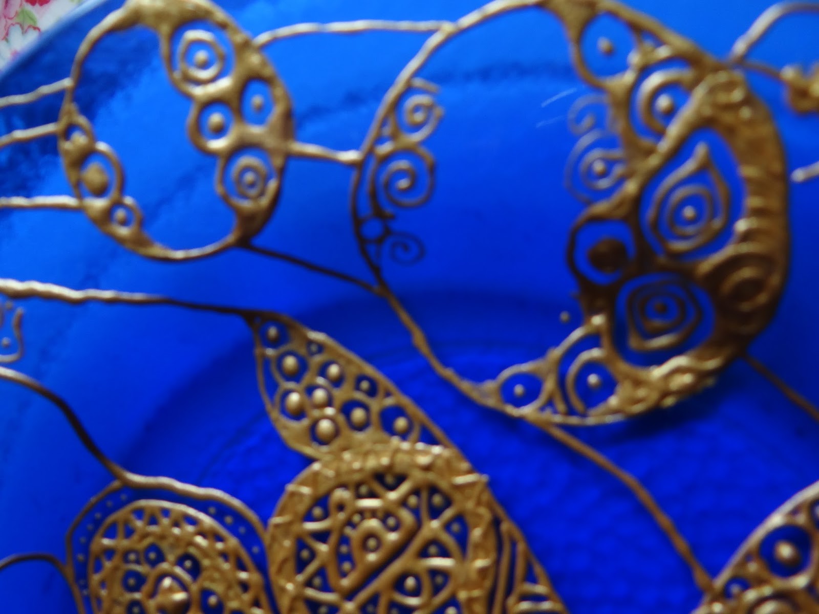
There are small items to spot every few yards – this beautiful Art Nouveau detail was situated on a large building – I could not resist the curving lines and the way the numbers flow into each other.

03-IMG_1956

If you love architecture then you have to look upwards, this beautiful Art Nouveau building shows just how much it influenced the Art Deco period, those long windows and angular lines echo the aesthetics of Mackintosh we later see at Hill House, see below.

10-IMG_2838

Just ten minutes outside of Glasgow the landscape is transformed into wild hills and breathtaking views – we drove along the road past Loch Lomond and on to Helensburgh and Hill House. Now owned by the National Trust for Scotland, it is a complete example of Mackintosh’s work – he was commissioned by Glasgow Publisher Walter Blackie who remained living at the house until the National Trust took it over. Art Nouveau Artists believed their art should encompass every aspect of the house from the building right down to the tiny details  of the room decoration; the internal design was as carefully planned as the house house itself. Even the kitchen shelving contained small flower shaped motifs – even though the owners would never set foot inside as they employed a cook.

11-IMG_2834

I believe Margaret contributed equally to her husband’s work; he praised her often believing she was the real talent of the two although her work was mostly disregarded until a few years ago when the May Queen was bought for 1 million. It was an absolute thrill  to see her artwork up close – she was exceptional -one of the few women to attend Glasgow School of Art in the late Victorian age when women’s education, even for the wealthy, was limited.  She learned smithing, needlework as well as traditional painting and drawing.  The are panels on the walls – her gesso plasterwork was a delight the curved lines and swirls of fay women – reminded me of Beardsley’s Fairy tales. The embroidery on the chairs and two beautiful panels in the main bedroom were her own design as well as curtains featuring flowing geometrics and curving organic shapes in black and white.

The classic rose motif stencilled on to the walls –  is a element throughout the house, the palette is muted, predominantly black and white with a tiny dots of rose coloured blocks or  flowers. The furniture was created to cast shadows that danced with the squares on the carpet, shifting as the sun moved across the sky – while the lamps featured rose circles reminiscent of honesty flowers – their discs harmonising with the straight lines of the lamps continued the effect at night.


On the eastern side of the house a round tower soars above the roof, with a spiral staircase – connecting the nursery to the schoolroom – it is also echoed by a smaller tower in the garden that acts as a toolshed. He designed the nursery on the Eastern side of the house to benefit from the early morning sun – while the Master Bedroom on the opposite side would capture the setting sun. All the living areas face south to make the most of the sunlight.

Despite their talent Margaret and Rene died in relative poverty, the first world war brought Art Nouveau to an abrupt end – it seems such a pity that they were not given the recognition in their lifetime, they could have had the commercial success of William Morris, but their influence and vision continued through to the Art Deco movement at its height in the 1930s.

love

There was so much to delight the eye – meticulous attention to detail from every nook!  It is so inspirational that I am sketching again with an idea of a painting forming.

For any Art Nouveau lover – Hill House it is well worth a visit – the gardens have the most wonderful view across the river and are beautiful even in cold frosty April.

My only advice is – no- matter how delightfully sunny the weather when you set off – always take an umbrella when you visit Glasgow!

ttfn x

Sunday sevens is the brain child of Nat at Threads and Bobbins a round up of your life in 7 pictures, posted on a Sunday. I don’t  post every week – (my life isn’t that exciting) but I do post when there is more in my life than cake baking, washing and housework!


acrylic, art, blue, canvass, craft, creations, creative, creativity, decoration

Be the change you wish to see in the world

01-IMG_2489

Given the shocking events of last Friday, it is so difficult to find the right words – but I remembered this collage canvass I made some years ago and it sums up my feelings about this whole situation.

It was created at a time when I had lots of my girlfriends coming for tea and cake to my studio but they were terrified of doing anything arty, so we began to paint with glitter; it was such an easier fun way to be creative.

03-IMG_2491

While the top quotation says

You must be the change you wish to see in the world

I wanted to express the transformation that love can bring – so I used words that would also link together to create love.

04-IMG_2492

Butterflies symbolise transformation I wanted them to look as if they had just rested a moment on the canvass.

05-IMG_2493

While the swirls of blue and white create movement

06-IMG_2494

Some might call it childish, I found great pleasure in using the blue tones mixed in with a little purple.

07-IMG_2495

The butterflies were cut from a lovely birthday card I had received earlier in that year.

08-IMG_2499

Around the canvass you can also see tiny seed purls – another suggestion of transformation – an oyster changes an irritating grain of sand into a thing of beauty.

09-IMG_2500

I won’t focus on how much this world is full of hatred and misery

10-IMG_2501

but instead,  in my own small way, spread love with a smile, a word of thanks or a listening ear. Not world changing but within my power.

02-IMG_2490


art, decoration

Study in blue and gold

09-DSC03234

We travelled to Austria a little while ago to see the Art Nouveau artists Klimt and Sheile it was such a tremendous joy to see the paintings up close.  I was so inspired by Klimt’s use of gold in his paintings that I wanted to create a little homage to his art. I did a few sketches using a gold pen just to get a feel for the design – its at this playful stage that elements and accidents combine.

A study in gold

I love the combination of indigo blue and gold – I had a plain glass serving plate that would make a good base for a Art Nouveau design – and the gold outliners are delightful to work with and more in my price range than gold leaf. The indigo made me think of the sea, and so I wanted circles to form like bubbles bursting forth across one side of the plate while the other contrasted with geometric elements in curvy lines.

bubble shapes

There were circles within the bubbles, as well as eye like features (Klimt uses a lot of Egyptian symbols)
Organic shapes gold on blue

I followed the contours of the lip of the plate, and you can just see my signature on the left of this picture

gold on blue - plate

I love the organic shapes prevalent in Art Nouveau so I incorporated swirls, petals and bean structures alongside triangular shapes. I discovered the gold could also be layered, so that even solid areas had surface decoration. It took approximately a week to decorate the plate and I altered the designs slightly from my original sketch because it was difficult to go into really fine detail.

blue and gold plate susanna di milo

So here is the finished plate – it looks glorious when the sun shines through the glass, I have it sitting on my windowsill – it was great fun to do. I may try to make some glass plates next time so that I can incorporate a little more tone in the back ground; It is something I would like to develop further.

art, drawing

Sketching Challenge

After my promises post, I decided to give myself a little more time for fun. I love drawing and painting but don’t really do much because sewing seems a much more practical use for my time. But when I draw or paint I really do get lost int he process, definitely a becomes meditative and time just slips away along with any worries or woes!

So I have promised that I will do more art! No backsliding it is here in black and white and now on my to do list!

I thought I would participate in a daily drawing challenge, as I needed something to aim at, it was run by a local Artist on the Art Trail this year. It was only a small little sketchbook with thirty pages, so it doesn’t feel daunting.

01-Missing key

Challenge 1 – A Key – I thought I would use negative space instead of observation, I love doing swirly doodle lines so this is entitled – the missing key!

03-Hat

Challenge 2 – A Hat – this is one of my favourites, its a bright red felt pillbox! I really enjoyed the sharp shadows and the dome.

04-Hat 1

Challenge 3 – A pair of scissors – graphite offers so much fun with tone, the handles had quite exciting curves! Of course they had to be dressmaking scissors!

05-Glass object

Challenge 4 – a Vase – this tiny vase is a beautiful Swedish glass maker. The colours change throughout, they make an interesting subject for coloured pencils and it is quite wonky, the test was to replicate the wonkiness and resist the desire to straighten it up!
07-Cotton reel

Challenge 5 – Something red, back to sewing! this cotton reel was good fun to study, had to be coloured pencils otherwise it would not be red.

seam ripper

Challenge 6 – A tool (of course it had to be a sewing tool!) Sadly this is used quite often!

06-Glass object 2

Challenge 7 – Glass Could not resist going back to the wonky vase to have another go! This time from another angle you can really see the wonkiness now!

The great thing about this exercise is that you can focus just on a small object rather than trying to compose a painting or drawing. The scale is simple and the idea of the challenges were achievable in a short space of time.

It has inspired me to do more drawing and certainly has tightened up my observation although these are no way perfect! I think it helps to have something to focus on – I enjoy being challenged. I find without them I can’t seem to focus there is just too much choice.

Do you enjoy challenges?

Susanna Signature

art, decoration, glass plate., gold, gold work, klimt, painting, plate

My homage to Klimt

Back in July we went to Vienna to see the art nouveau movement paintings, in particular Klimt and Shiele. I loved the way Klimt used gold with a lot of the decoration looking like egyptian hieroglyphics Which inspired me to try my hand at painting with gold… Of course this is not real gold but a gold paste for decorating china! 

I love the combination of  blue and gold

this plate was given to me by my son

So it was wonderful to make it into a work of art

art, drawing, Pablo Neruda

Pablo Neruda Poem

I did this poem for S for his birthday, it is one of my favourites – we both enjoy Art Nouveau and so I based each of the lines using the forms as a basis for the design. 
I enjoyed creating the flowing symmetry

these are all pretty small about 4 inches by 5

I tried to make each window a little different, combining arches 

This is a line drawing of the two of us. 

with squares 
Circles 

and ovals – this is our two initials – S creating a swan
I love the way the moon is a reflection of the sun. 
I really enjoyed this project and it has made me think about doing some greetings card designs. 

art, art books, book review, Books, crafting books, creative, doodling, photography, vintage, vintage projects

Homespun Vintage – Book Review

I love books and there is nothing I enjoy more than sitting in Waterstones with a pile of books to browse through, a cooling latte at my elbow and time to relax!

My family know me so well that they give me book vouchers for Christmas – to me they are a ticket to adventure – book shops are just like travel shops each one offers an experience to travel from your armchair! This morning I spent a very happy hour, (always best alone so I am not dragged out! I can browse for a long time without feeling guilty!) in Waterstones Chichester.

I found this delightful book by Jane Crowfoot, the photography is delightful – giving crochet and knitting projects that charm. She has caught the vintage trend very well, but has broadened it out with folksy projects (Folk Tales) alongside Art Deco (Two tone Chic), and modern vibrant retro vintage (Time for Tea) to create a timeless collection of patterns and designs that are inspiring and will have knitters and hookers reaching for their wool.

art, birds, blue and white, charity shop finds, chic, country style, craft, customising, design, flowers, recycling, shabby chic, sharpie pens, vintage

Table revamp

I love the curves of this table, painting furniture white always brings out the form of a piece of furniture and I find it extremely satisfying. I drew the design using a sharpie pen, just doodling the flowers and the birds. Afterwards I sealed the pen design with clear varnish. It is such an easy thing to do, and it really can transform an ordinary object into a work of art. 

acrylic, art, canvass, painting, projects

poppy

This is the second poppy painting and my favourite, it is acrylic on canvass. I painted it as a wedding present for a friend of mine. I love the way the centre of the poppy seems to come out of the painting. I love poppies for their deep colour, this was my second painting ever, so I was very pleased with the results. Sometimes I wonder why I don’t do more painting! There are just not enough hours in the day.